Leapt Years • a Review, a Report Card, a Redesign
Summary: My life has been torn asunder and rebuilt. But not in a bad way. So, you get a new website.
But seriously, it’s a lot more fun to read the whole story. Living it is also interesting.
Some of us greet change with open arms. Some of us run it down with pitchforks and torches.
I’m somewhere in the middle. On a purely theoretical level, I adore change and the potential it brings for re-evaluation and improvement. When actual change comes knocking though, big or small, trepidation is my name.
Oh, in the end I usually embrace, or at least accept it - but first, I try to talk it to death. I need to methodically go through all the plusses and (in far greater detail) the negatives. And I need to do this verbally. Out loud. At another person.
Back in early 2015, I wrote about redesigning this website and switching to Squarespace. I also wrote about some potential changes coming to my life. At the time, I was talking about taking on a (near) full-time teaching job. That’s come and gone.
The real upheaval, the truly earth-flipping, bridge-burning, world-churning events weren’t even on my mind at that time. My wife and I had a baby girl. She’s wonderful, and rambunctious, gorgeous, and naturally brilliant, thanks for asking. And that’s not just a daddy talking. Her grandma thinks so too. Then we moved from Fukuoka to Osaka. Then to a different part of Osaka. Then after a review of family finances (ugh) and earning potential (double ugh) my wife went back to work while I stayed home, making art with one hand and herding the little one away from sharp knives with the other.
It’s been an interesting challenge, and all of my child-rearing fantasies were very quickly swept away. Yes, I thought I would sit in my studio making art while she contentedly played by herself, somehow absorbing English language skills. Turns out, infants need to be taught how to person. Go figure. So, I work whenever the little lion is snoozing.
The point is: change is constant, and flexibility is demanded.
All the while, the art world has been in a state of upheaval as well. Maybe not the ART WORLD, the top tier, multi-million dollar selling, superstar level. But for those of us down in the trenches (ahem, the 99.9%), there have been a lot of interesting happenings. And some real revolution in the ways most people find and buy art these days.
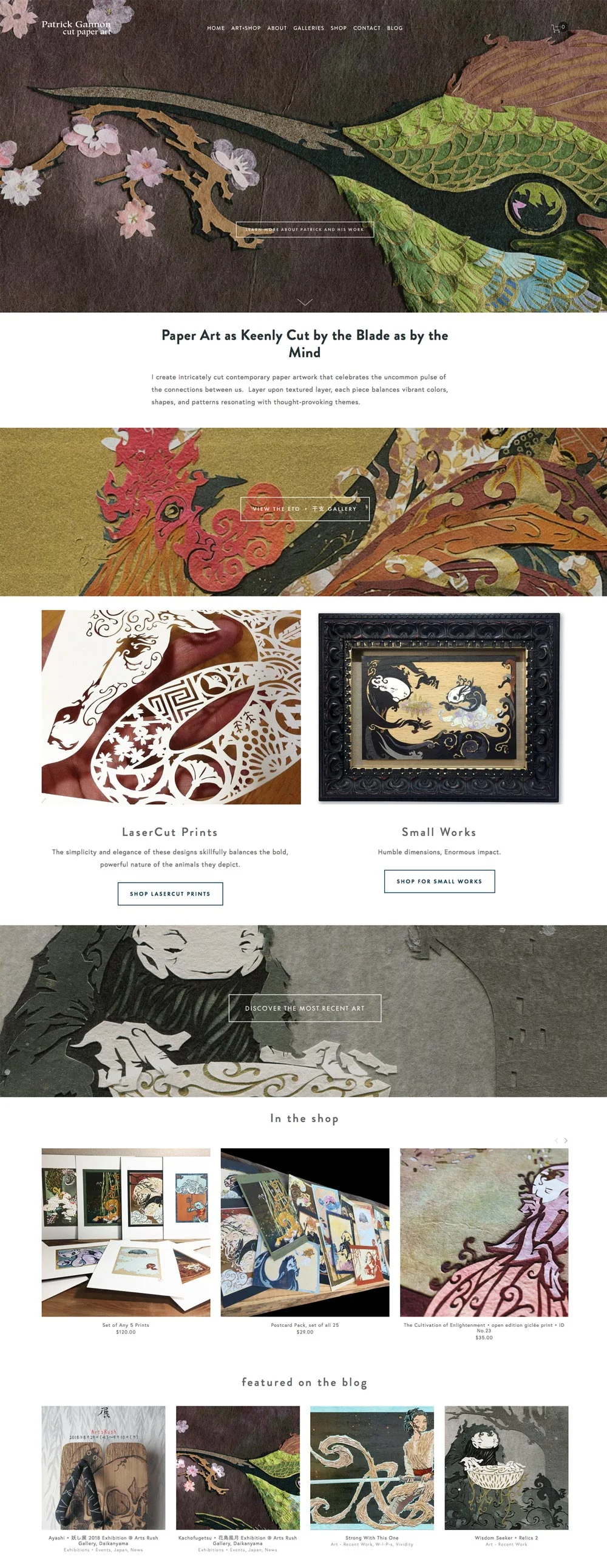
A website serves a purpose, and as my life, my art, and the world of art change, it follows that the website must too. In 2016, I think, I switched the site over to a different template. That’s a mostly superficial change, though. This new version is a re-thinking of how I interact with galleries, collectors, fans and art-lovers, and the simply curious.
In a nutshell, my previous sites were basically portfolios to show off my work, first to art-directors, then to gallerists. Without excluding those good folks, this new version hopes to talk to the people who love my work more directly.
Right now, I’d like to review my goals back in 2015:
the good: reorganized from years into collections. Better!
the bad: There’s still a ton of new art that hasn’t been posted yet, for various reasons.
also: galleries used to have pride of place, but have dropped down a rung or two.
the good: It has finally been re-created.
the bad: It took sooooo long! I always hated the old, pseudo-academic, self-conscious writing in the old About page. Turns out, it was a matter of changing my mindset. When I sit down to write about myself and my work in a formal way, I freeze up and use big words. But I’m much more relaxed writing for this blog, or in emails to people with questions. The trick was to let myself talk directly to art-lovers.
also: It’s broken down by the most prevalent themes in my art and how they connect to my life. Also, more pictures!
the good: It is still a work in progress?
the bad: There are still blog posts with broken image links and tons of broken links. It’s amazing how many of the websites I used to link to are just…gone.
also: Art is a visual medium, so I’m experimenting with a more visual presentation. Instead of a plain scrolling list, There’s a grid style layout. With a link to the archive in the footer. I hope you like it.
the good: It’s finally here!
the bad: It only took 4 years!
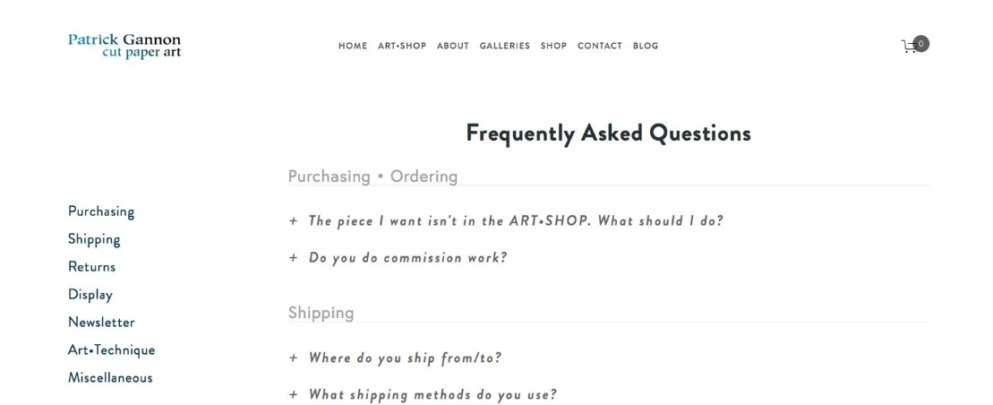
also: I plan to add more to as time goes by, so if you have any questions you’d like to see included, let me know in the comments below or email me.
the NEWS page
the good: Instead of making a dedicated news page, I plan to announce upcoming exhibitions, events, etc on the Home page
the bad: none?
Media
the good: …there is none yet
the bad: I haven’t gotten around to making a dedicated collection of articles, books, and press, but…
also: I will?
the good: There is a home page again, to welcome those who are new to my work, announce plans and events and exhibitions, point out cool stuff that’s happening or gonna happen, etc. I tried this once in 2015, but I never had a clear idea of the goal, how to design it, or who it should speak to. Do we give up? No, we try again!
the bad: There are some pages and sections that just aren’t ready yet.
also: there’s a dedicated Footer. I missed that in the last design. You can sign up for the newsletter straight from there, so I was able to get rid of the dedicated newsletter page.
the ART•SHOP is a story for another day.
So, all in all, I give myself a…B? I like the new changes, but there’s still room for improvement.
How about you? Love it? Hate it? Got questions? Let me know.


